Contents
Project Overview
Peloton experienced rapid growth during the COVID-19 pandemic, followed by a significant decline in subscriber retention. This project investigates the factors behind customer churn using a dataset of 317 survey respondents collected via Qualtrics, enriched with geographic and demographic data.
Research Questions
- What demographic and geographic factors are associated with Peloton customer churn?
- Do customers in certain income brackets or age groups churn at higher rates?
- Is there a relationship between population density and Peloton usage patterns?
Data Pipeline
The final dataset was assembled from three sources through a multi-step process, combining survey responses with geocoded location data and U.S. Census demographics.
Survey Data
Qualtrics survey with lat/long coordinates, usage behavior, and churn status
Geocoding
GeoPy API (Nominatim) converts 317 coordinate pairs to ZIP codes
Census Join
ZIP code join with 40,959-row census dataset for city, state, population, density
Feature Merge
Demographics (income, age, gender) and behavior data merged into final dataset
Data Sources
- Peloton Survey (Qualtrics) — 317 responses with GPS coordinates, churn status, and usage frequency
- GeoPy / Nominatim API — Free geocoding service converting lat/long to ZIP codes (rate-limited at 5s intervals)
- U.S. Census Population Density — 40,959 ZIP codes with population, density, city, state, and county data from FourFront.us
- Demographics & Behaviors CSV — Income, age, gender, and workout frequency per respondent
Sample Code: Geocoding with GeoPy
Geographic Distribution
Survey responses were distributed across the United States, with the heaviest concentration in California, New York, and other major coastal states.
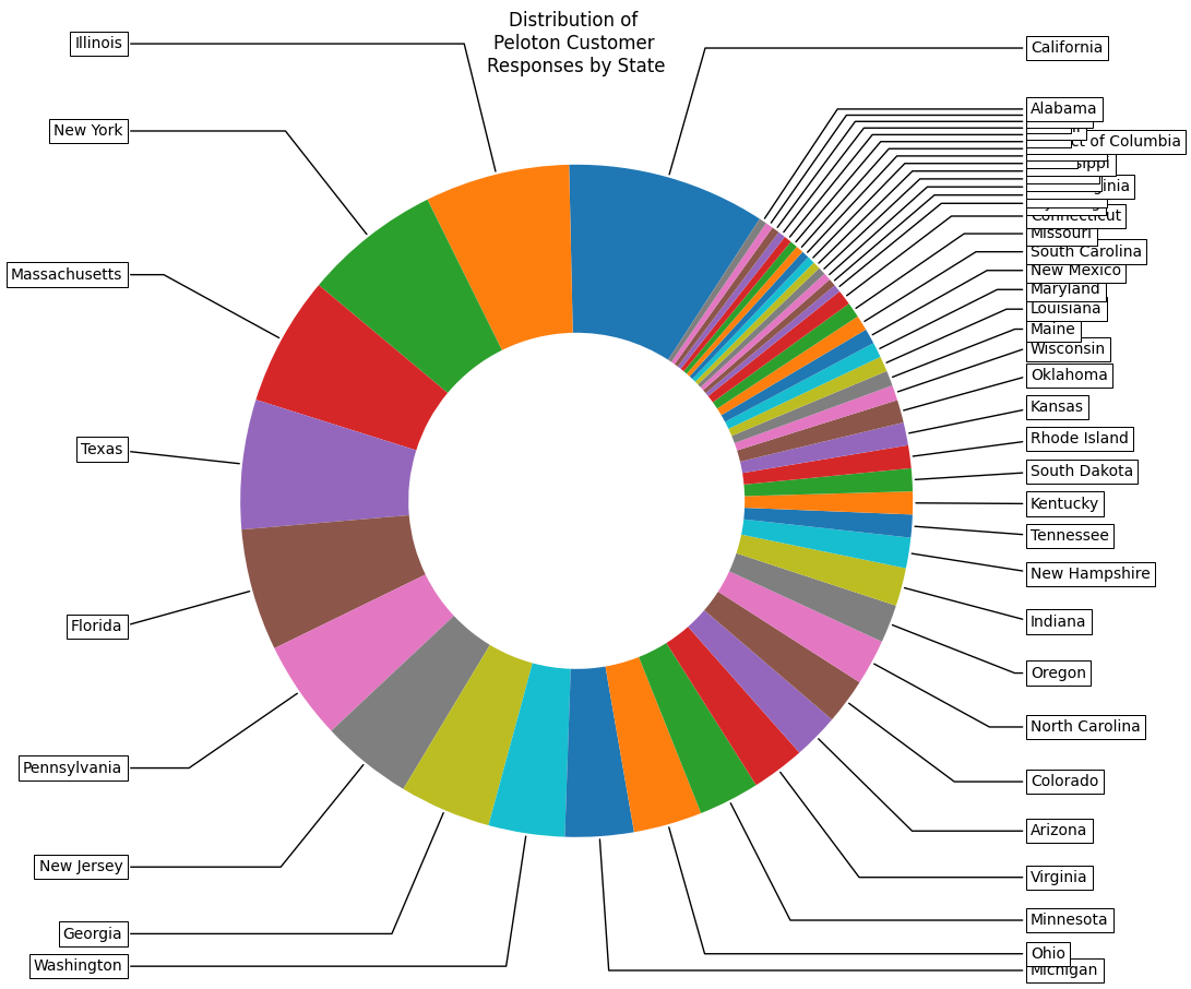
Distribution of Responses by State
A donut chart showing which states had the most survey respondents. California and New York dominate, reflecting Peloton's urban-coastal customer base.
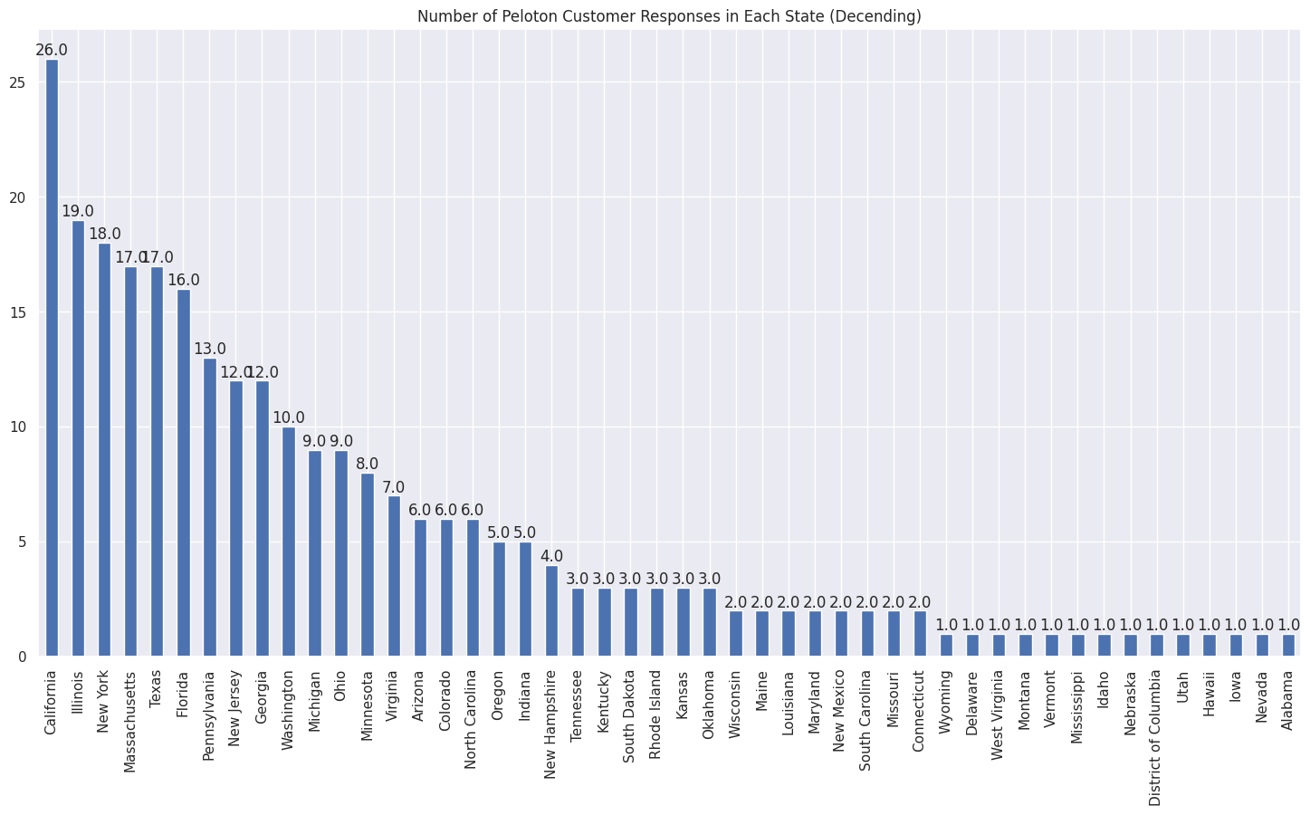
Response Count by State (Descending)
The same distribution as a bar chart for precise comparison. The long tail reveals that Peloton has customers spread across nearly every state.
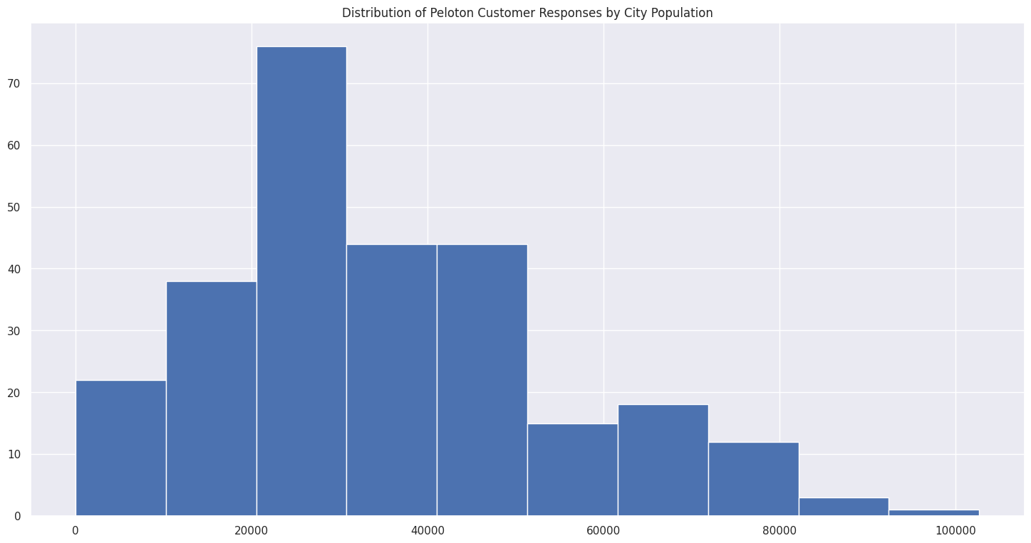
Distribution by City Population
Most Peloton customers are located in cities with moderate population sizes, with a right-skewed distribution showing some customers in very large metro areas.
Churn Analysis
Customer churn — defined as a reduction in Peloton usage over the past 6 months — was the central variable of interest. The visualizations below explore churn patterns across geography and age.
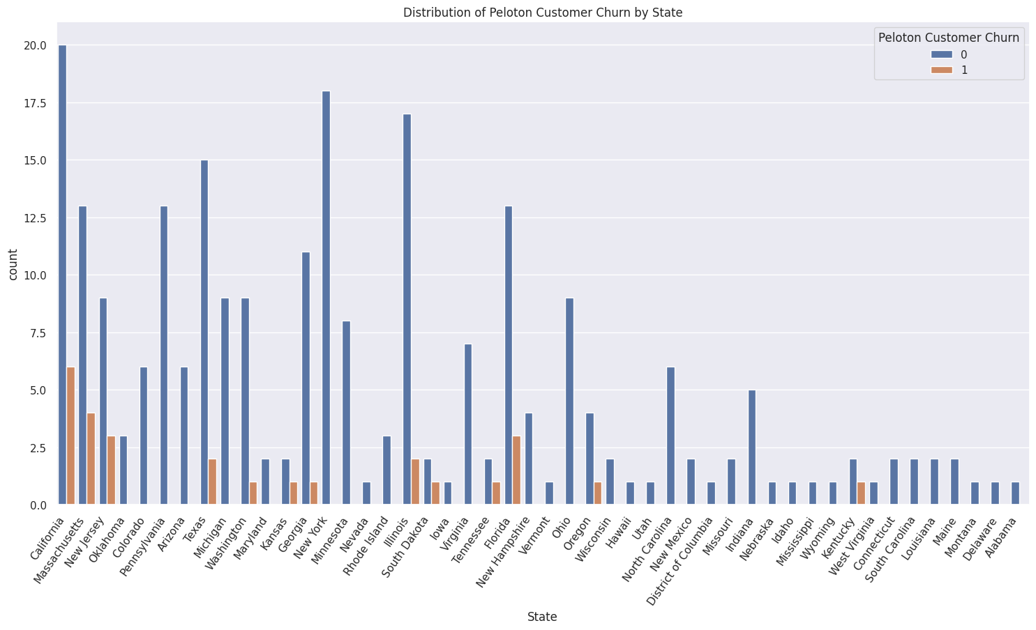
Churn Distribution by State
Stacked bar chart showing churn (orange) vs. retained (blue) customers in each state. California has both the highest total responses and the highest absolute churn count.
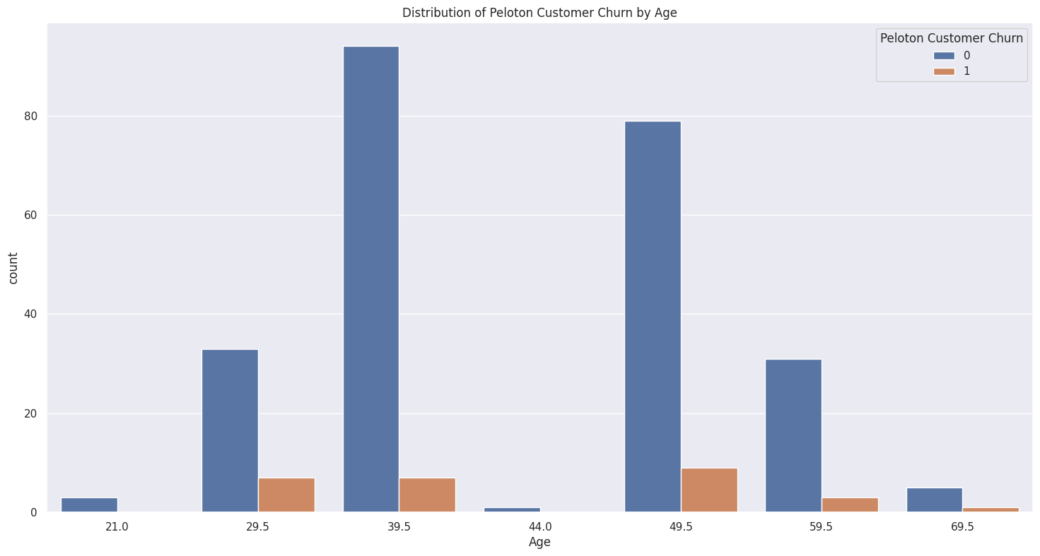
Churn Distribution by Age
Customer churn broken down by age group. Churn appears across all age brackets, but certain age groups show disproportionately higher churn rates.
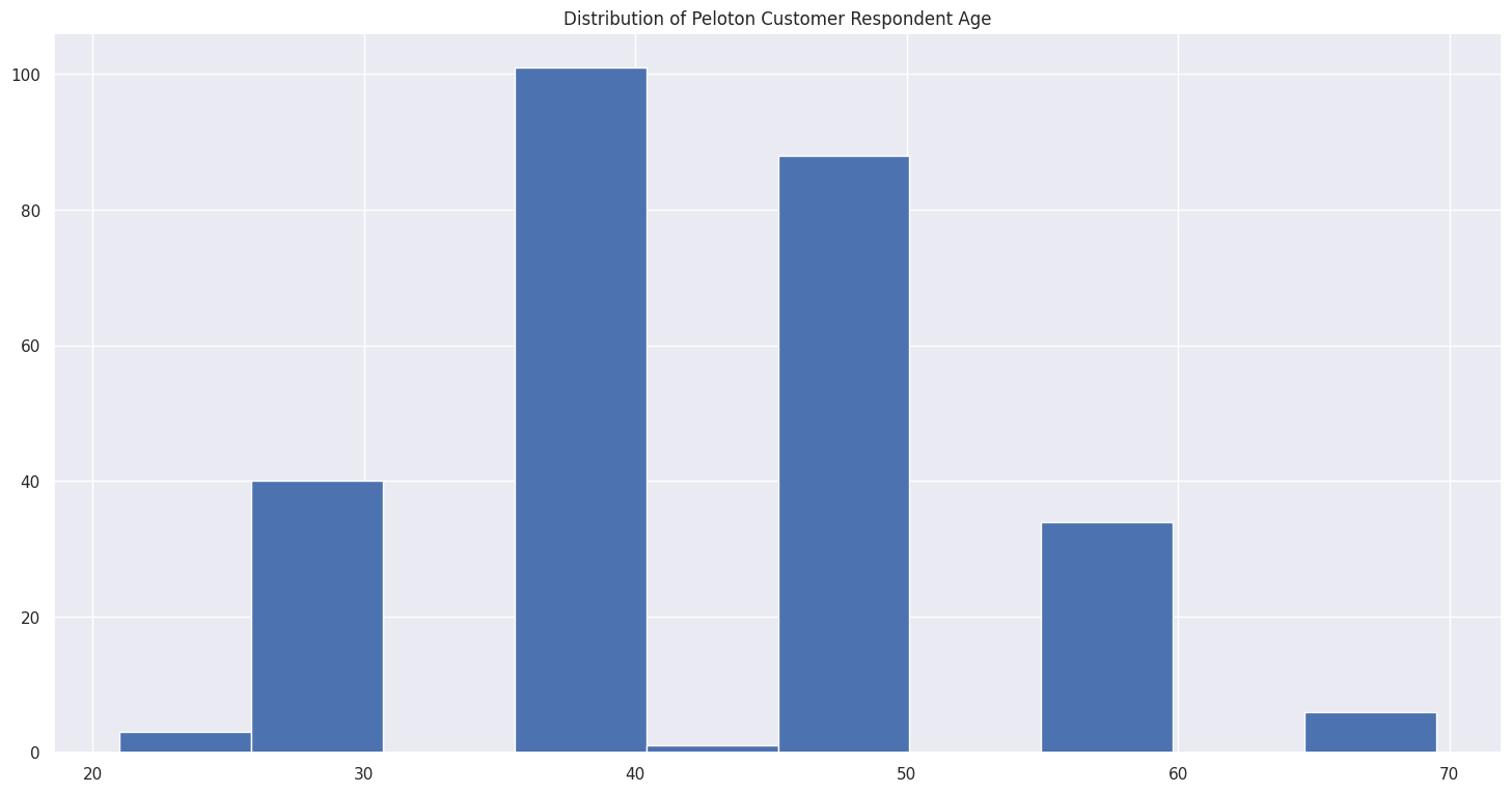
Age Distribution of Respondents
Histogram of the overall age distribution, providing context for interpreting the churn-by-age chart above. The majority of respondents fall in the 30-50 age range.
Demographics & Correlations
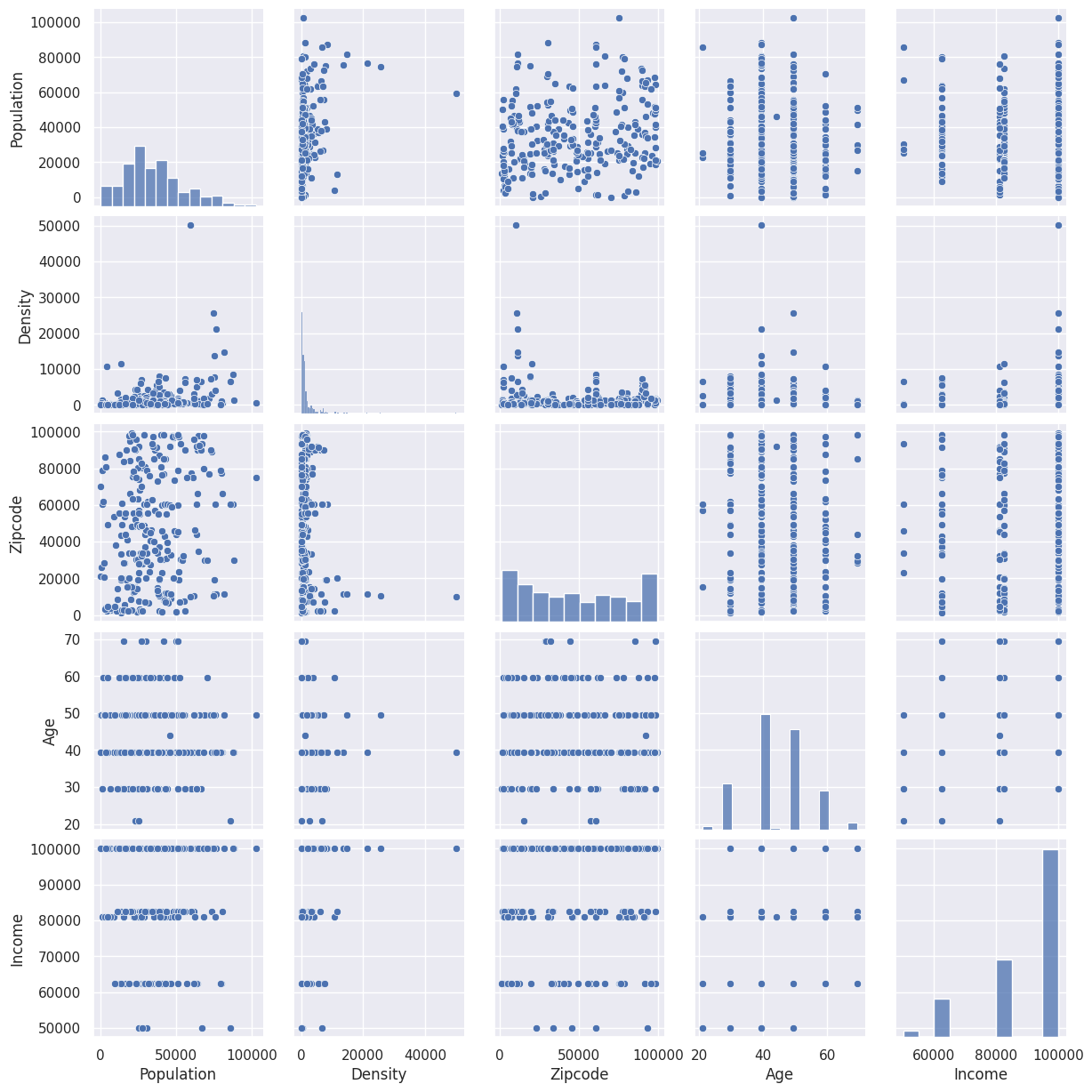
To understand whether any numerical variables share linear relationships, pairwise plots and correlation matrices were generated for population, density, ZIP code, age, and income.
Pair Plot — Numerical Variables
Scatterplot matrix exploring relationships between population, density, ZIP code, age, and income. No strong linear relationships are apparent between these variables.
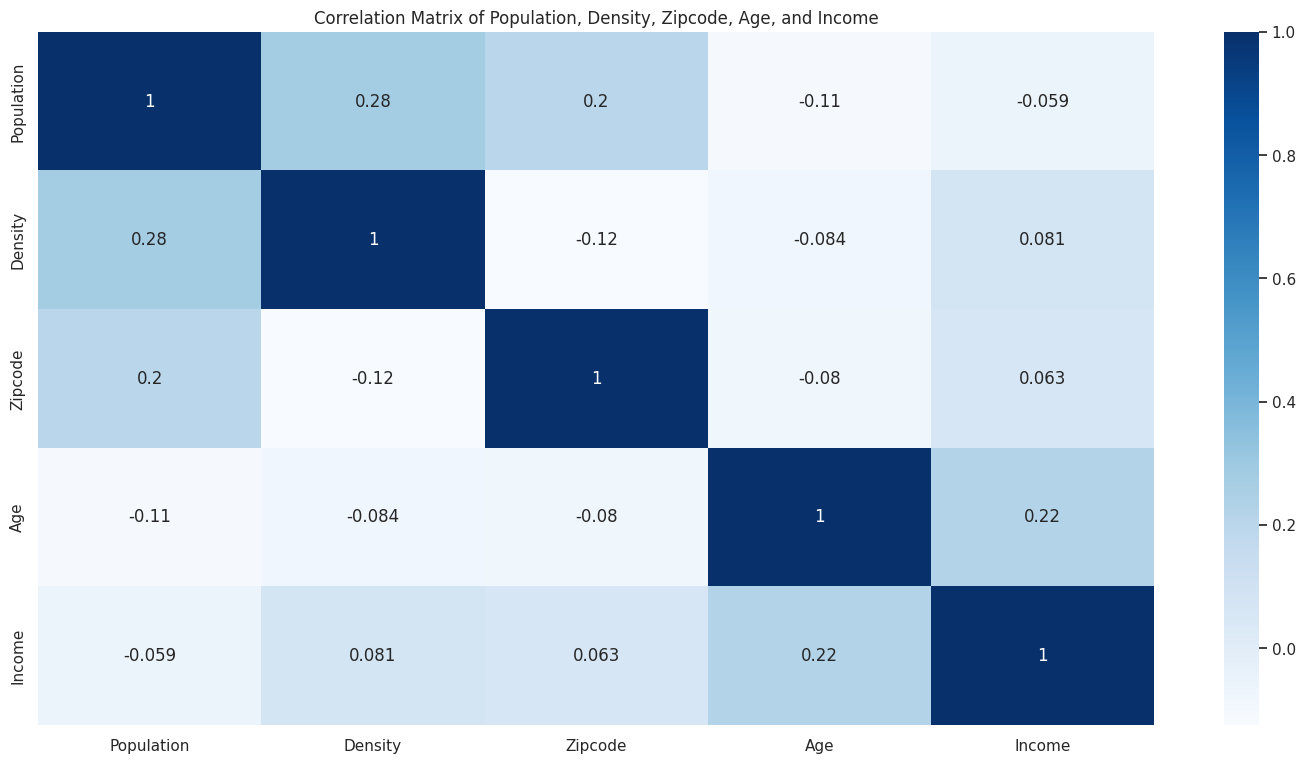
Correlation Matrix
A slight correlation exists between population and density (0.52), with a minor correlation between age and income. The matrix does not indicate a strong relationship between ZIP code, income, and age.
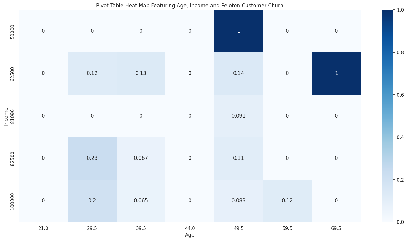
Churn Heatmap — Age vs. Income
This pivot table heatmap reveals two distinct churn patterns: (1) strong churn at lower income and higher age, and (2) a milder churn pattern at higher income and younger age (~29.5 years).
Key Findings
Two distinct churn profiles emerged from the analysis — suggesting that Peloton faces different retention challenges across customer segments.
Primary Findings
- Lower income + older age = higher churn. Customers with lower household income and higher age showed the strongest churn signal, potentially driven by price sensitivity or changing fitness priorities.
- Higher income + younger age (~29.5) = moderate churn. A secondary pattern appeared among younger, higher-income customers — possibly reflecting lifestyle changes or competition from alternative fitness options.
- No strong geographic predictor. While responses concentrated in coastal urban areas, churn was distributed across states without a clear geographic pattern beyond population density.
- Weak linear relationships. Traditional correlation analysis between numerical features (population, density, ZIP, age, income) did not reveal strong predictive signals, suggesting churn is influenced by behavioral factors not fully captured in this dataset.
Limitations
- Sample size of 273 (after cleaning) limits statistical power
- Self-reported survey data may contain bias
- Binary churn variable (reduced usage vs. not) lacks nuance
- Web scraping attempts for additional ZIP code data were blocked by anti-bot measures
- Geoplotting library (geoplotlib) had compatibility issues in Colab environment